PROJECT NAME
Facticerie
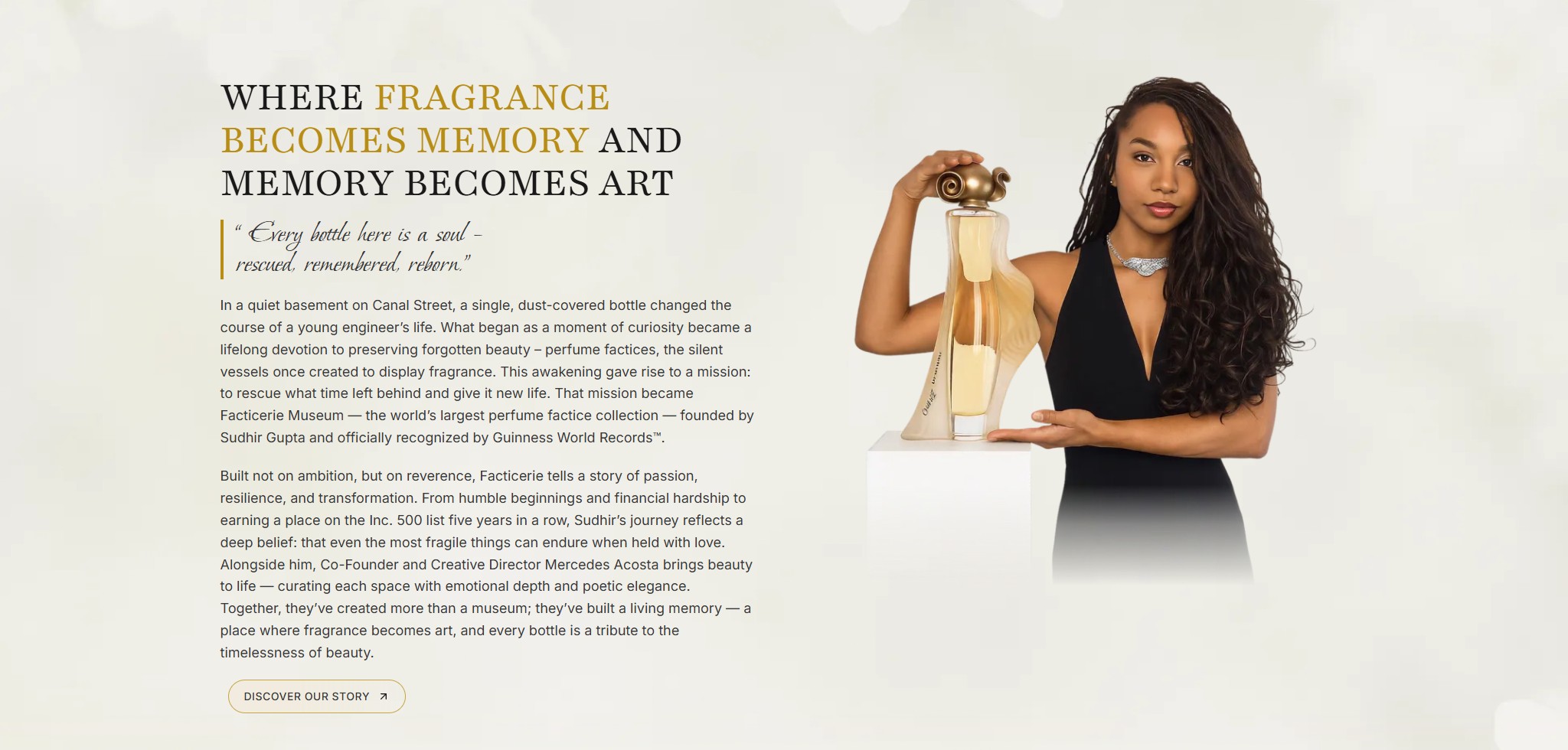
The Facticerie Museum in Hackensack, New Jersey, houses the world’s largest perfume factice collection, officially recognized by Guinness World Records. It is not merely a collection. It is a cathedral of remembrance, a place where beauty once forgotten stands luminous again.
Every bottle holds a story of craftsmanship, of creation, of hands that once shaped the invisible. Perfume factories are not artifacts here. They are witnesses. Each vessel carries the breath of entire eras, from the gilded salons of Paris to the ateliers of forgotten perfumers, a silent keeper of dreams distilled in glass.
A collection this extraordinary deserved a website that could hold its weight.
The Facticerie Museum holds one of the most visually extraordinary collections in the world. The old website told a completely different story, cluttered layouts, flat visuals, and inaccessible copy left visitors with no real sense of what makes this place so rare.
There was no way to convey the sheer, imposing scale of the bottles digitally.
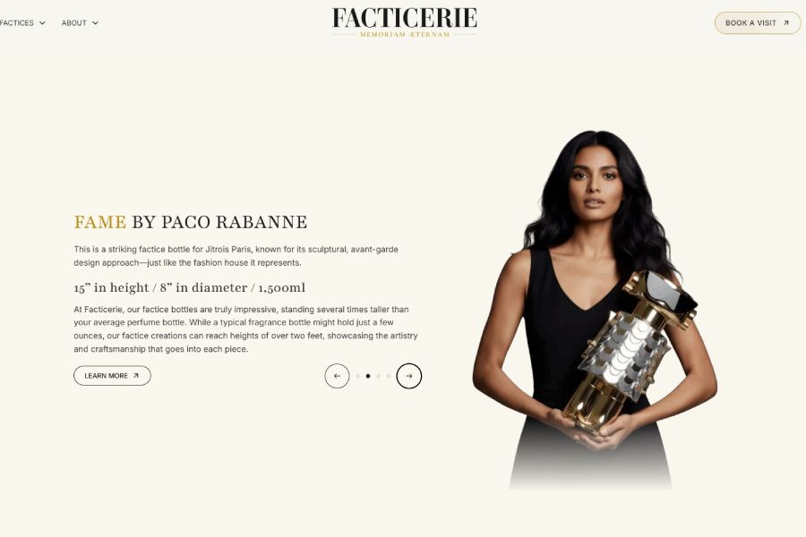
If there is one thing 10+ years of web design experience teaches you, it is this: elements need space to breathe. The original site packed too much into too little space, making it impossible for visitors to feel the presence and scale of these pieces. The majestic size of the factice bottles, some towering at 16 inches, was completely lost.
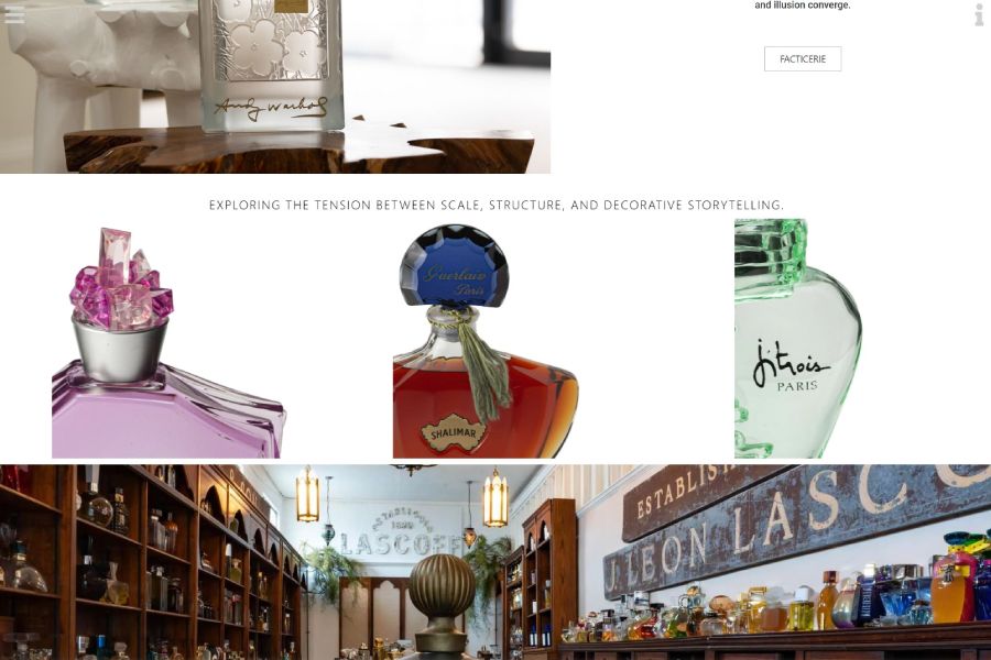
Some projects need more than two dimensions. Perfume factices are large, sculptural objects. Their proportions, surface detail, and artistic complexity simply cannot be captured in a flat photograph. When the product itself is the art, 2D design is not a limitation, it is a disservice.
The copy was disorganized, difficult to read, and written without a clear voice. Beyond that, several sections failed to meet WCAG (Web Content Accessibility Guidelines) contrast requirements, the color contrast ratios between text and background that ensure legibility for users with visual impairments. A museum built around beauty was, ironically, hard to see.
Before any design decision was made, we listened. Multiple meetings with the client helped us understand not just what the museum is, but what it means to the people behind it. What started as a young engineer finding a dust-covered bottle on Canal Street became a lifelong mission. That kind of story shapes every color, every typographic choice, every line of copy.
We audited the existing site, studied the collection in detail, and mapped out the full content architecture before writing or designing a single element. The right visual direction, tone, and technical approach only becomes clear after that kind of groundwork.
This was not a redesign. It was a transformation. We rebuilt Facticerie from the ground up, from logo to layout, with every decision serving the same goal: giving this collection the digital presence it deserves.
New logo, color palette, and typography system built to match the luxury, elegance, and emotional weight of the collection. A black and white foundation that lets the bottles speak.
We integrated custom-built 3D models that allow visitors to experience the factices the way they were meant to be seen, from every angle. These are not static images. They rotate as you scroll, revealing the craftsmanship and detail that flat photography simply cannot capture.
Every section was structured with intentional spacing. Clear visual hierarchy, generous whitespace, and copy written to match the museum’s poetic voice. Luxury does not shout. It commands attention by knowing when to be still.
The new Facticerie website does what the old one never could. It makes you feel the collection before you read a single word.
If there is one thing 10+ years of web design experience teaches you, it is this: elements need space to breathe. The original site packed too much into too little space, making it impossible for visitors to feel the presence and scale of these pieces. The majestic size of the factice bottles, some towering at 16 inches, was completely lost.
Custom 3D factice models rotate as visitors scroll through the page, showing every surface, curve, and detail. For a global audience that may never visit in person, this is the closest thing to holding one in your hands.
The client was so moved by the final result that he personally invited the Pixerize team members involved in the project to be his guests in New York. That is the kind of outcome no metric captures, but one we will never forget.